

Como
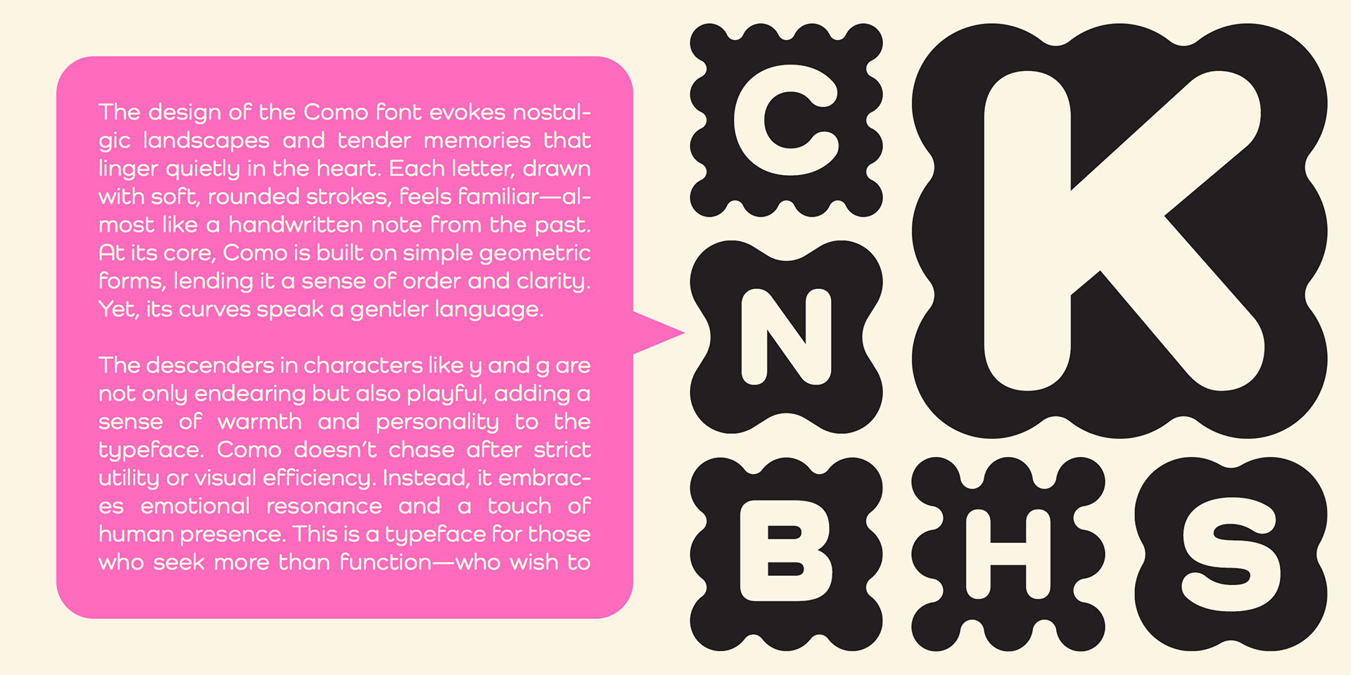
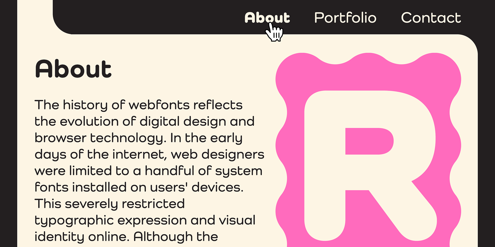
Como is a modern rounded sans-serif type family designed by Ryoichi Tsunekawa, consisting of 8 weights from ExtraLight to Heavy.
Built on a geometric foundation, Como features rounded terminals that soften its structure, striking a balance between neutrality and warmth.
Its refined, minimal design ensures universality and consistency, making it suitable for all media and purposes—from digital interfaces to print materials.
Its refined, minimal design ensures universality and consistency, making it suitable for all media and purposes—from digital interfaces to print materials.
The large x-height enhances legibility and readability, while the rounded edges add a friendly, approachable character that subtly enhances visual appeal without overwhelming the design.
Como supports Western, Central, and South Eastern European languages, as well as Afrikaans.
It also includes superior and inferior figures, denominators, numerators, and fractions, all accessible via OpenType features.
It also includes superior and inferior figures, denominators, numerators, and fractions, all accessible via OpenType features.
