


Compasse
Compasse is a semi-condensed sans-serif type family designed by Ryoichi Tsunekawa, consisting of 12 styles—six weights from Thin to ExtraBold, each with matching italics.
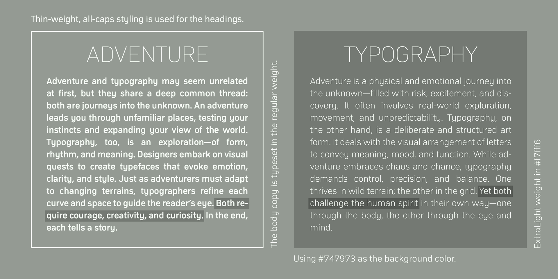
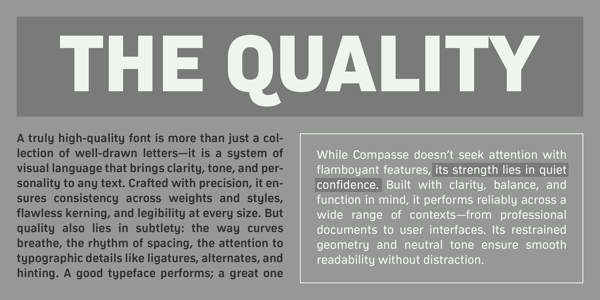
The wide range of styles offers excellent flexibility for titles, headlines, and body text, while the large x-height ensures strong legibility and readability across sizes.
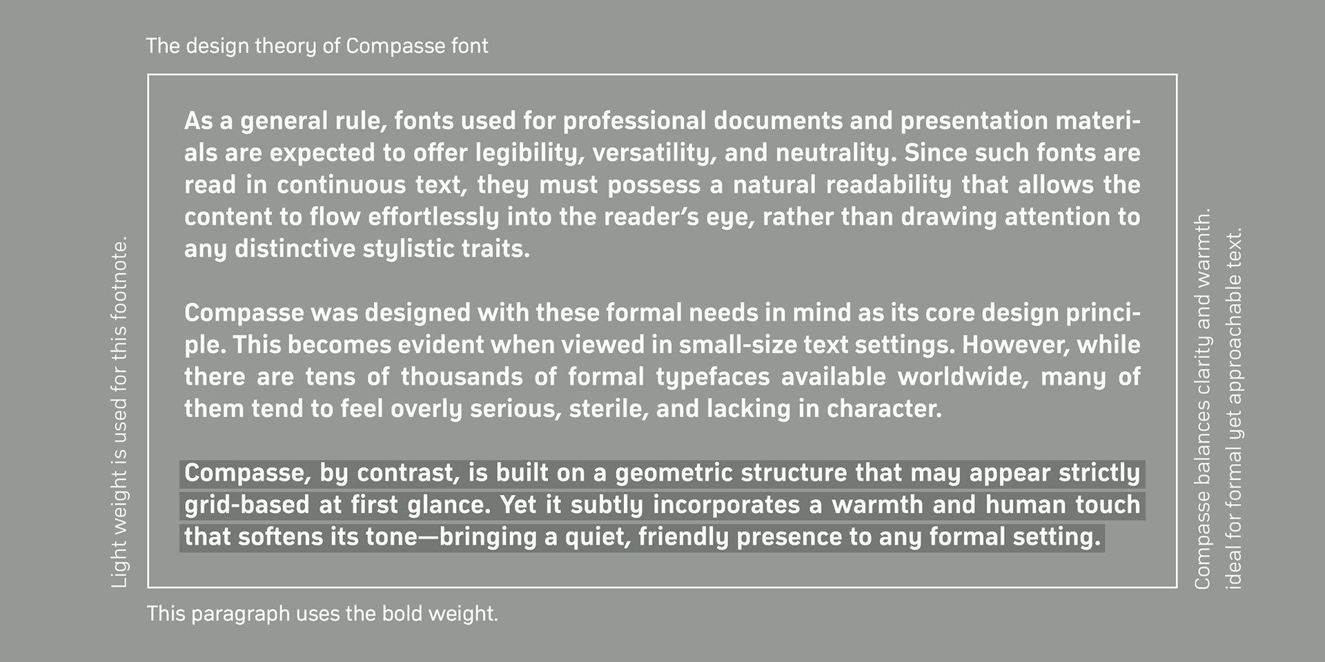
Unlike overly modular designs, Compasse was developed with a semi-modular approach, guided by the designer’s experience and intuition.
This results in letterforms that feel balanced, natural, and refined, avoiding the rigidity often associated with purely modular type.
This results in letterforms that feel balanced, natural, and refined, avoiding the rigidity often associated with purely modular type.
With its sophisticated structure and neutral, universal design, Compasse is suitable for use across all media and purposes, from editorial to digital and corporate branding.
It supports a wide range of European languages, including Western, Central, and South Eastern European languages, as well as Afrikaans.
OpenType features provide access to superior and inferior figures, denominators, numerators, and fractions, enabling advanced typographic control.
OpenType features provide access to superior and inferior figures, denominators, numerators, and fractions, enabling advanced typographic control.