
Golden Decades
Golden Decades takes us back to the basics—a return to the timeless principles that shaped modern typography.
Over the past decade, the type design world has become increasingly chaotic, with markets flooded by both brilliance and noise. Amid this complexity, one golden path remains clear—a path that began with the Industrial Revolution, passed through the clarity of the Swiss Style, and continues today with the enduring appeal of the sans-serif.
We call the era spanning from the "Less is more" ethos of Swiss modernism to the current "Less, but better" philosophy the Golden Decades. It was in this period that type design fully embraced modernism, prioritizing clarity, function, and form.
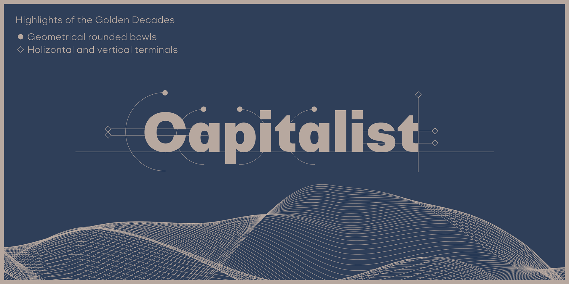
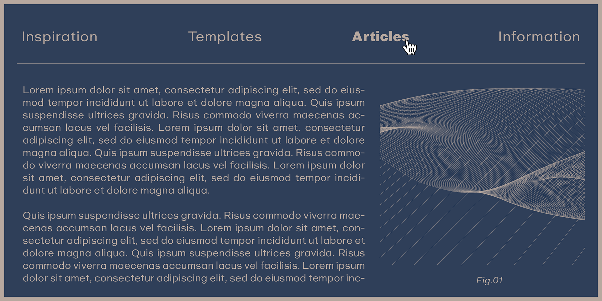
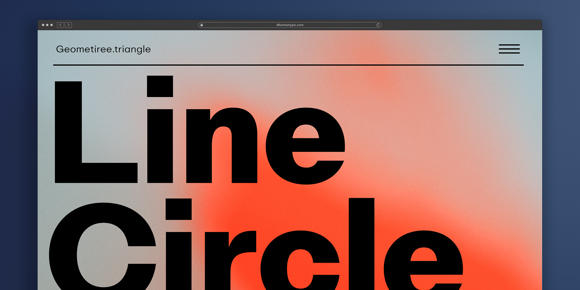
Rooted in these ideals, Golden Decades is a new geometric, minimal sans-serif that revives this legacy with a contemporary twist. Cool, calm, and carefully refined, it brings sharpness and neutrality to modern design. Its rounded bowls and open counters introduce a sense of rhythm and approachability, while retaining a highly functional and versatile tone.
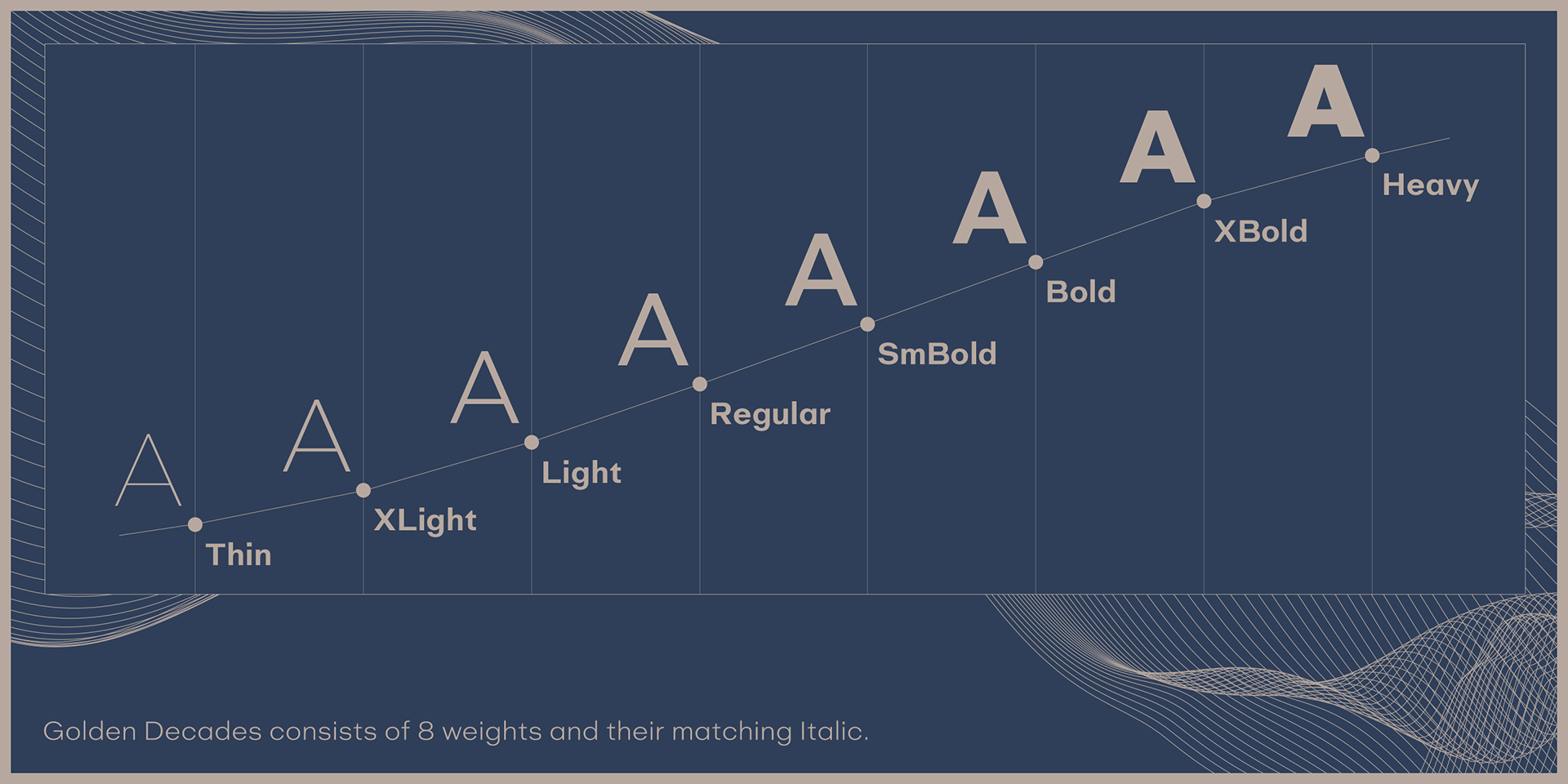
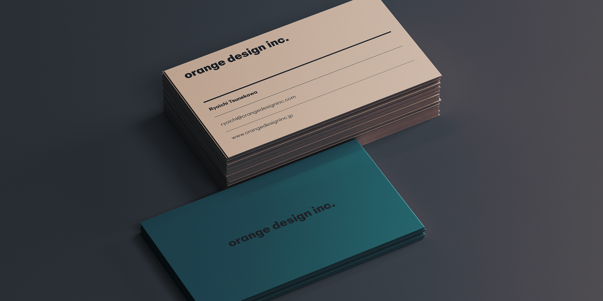
The family includes 8 weights with matching italics, making it ideal for everything from editorial layouts to digital interfaces and branding.
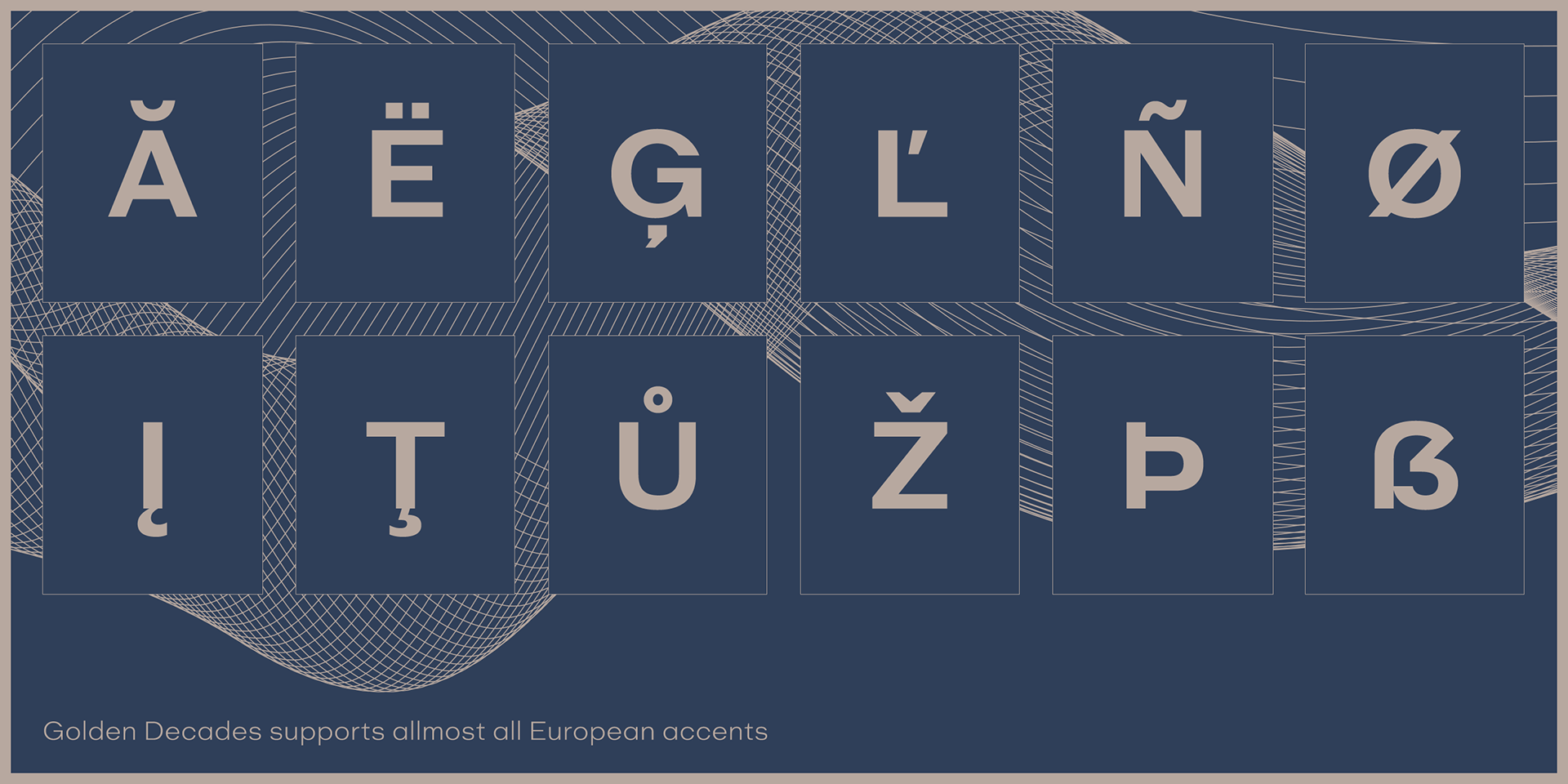
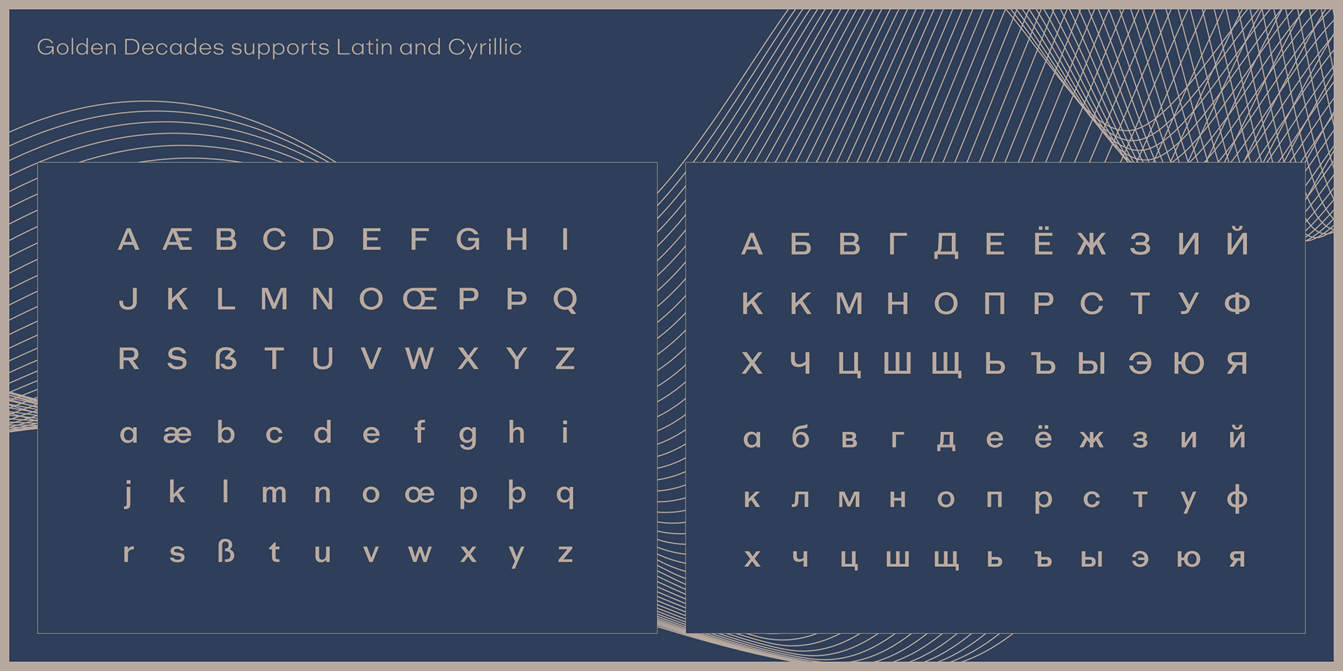
Golden Decades supports an extensive range of international Latin and basic Cyrillic languages, including Basic Latin, Western, Central, and South-Eastern European scripts. It also covers major encodings such as Mac Roman, Windows-1252, and Adobe Latin 1–3, ensuring compatibility across platforms and publishing environments.
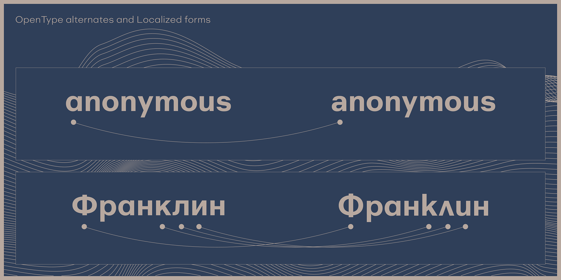
For advanced typographic expression, the lowercase “a” includes a stylistic alternate, accessible via OpenType features.