

Gomme Sans
Gomme Sans is a wide, masculine sans-serif type family designed by Ryoichi Tsunekawa, tailored for text and display use.
The family includes 6 weights, from ExtraLight to ExtraBold, each with matching italics, offering strong typographic flexibility.
The family includes 6 weights, from ExtraLight to ExtraBold, each with matching italics, offering strong typographic flexibility.
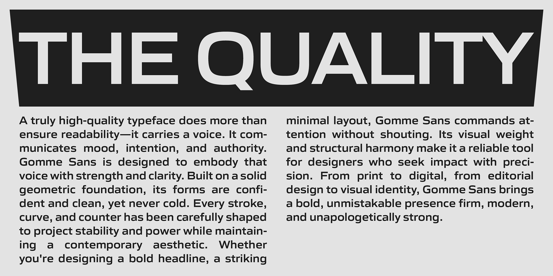
With its squarish, bold letterforms, Gomme Sans is designed to create a powerful visual impact.
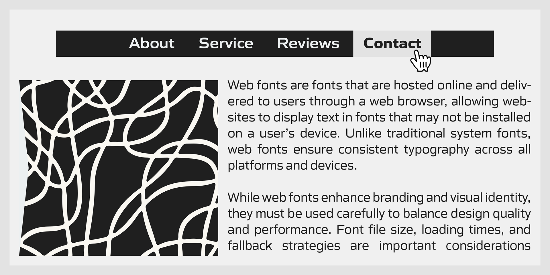
At the same time, its sophisticated construction and large x-height ensure excellent legibility and readability, even at small sizes on screen.
At the same time, its sophisticated construction and large x-height ensure excellent legibility and readability, even at small sizes on screen.
Gomme Sans supports a wide range of European languages, including Western, Central, and South Eastern European languages, as well as Afrikaans.
It also includes a comprehensive set of OpenType features—such as proportional figures, superior/inferior figures, denominators, numerators, fractions, ordinals, and case-sensitive forms—making it a dependable and versatile choice for modern typography.
It also includes a comprehensive set of OpenType features—such as proportional figures, superior/inferior figures, denominators, numerators, fractions, ordinals, and case-sensitive forms—making it a dependable and versatile choice for modern typography.
