


Kiro
Kiro is a minimal, condensed sans-serif type family designed by Ryoichi Tsunekawa.
The family consists of 12 styles—six weights from Thin to ExtraBold, each with matching italics—offering versatility for titles, headlines, and body text.
The family consists of 12 styles—six weights from Thin to ExtraBold, each with matching italics—offering versatility for titles, headlines, and body text.
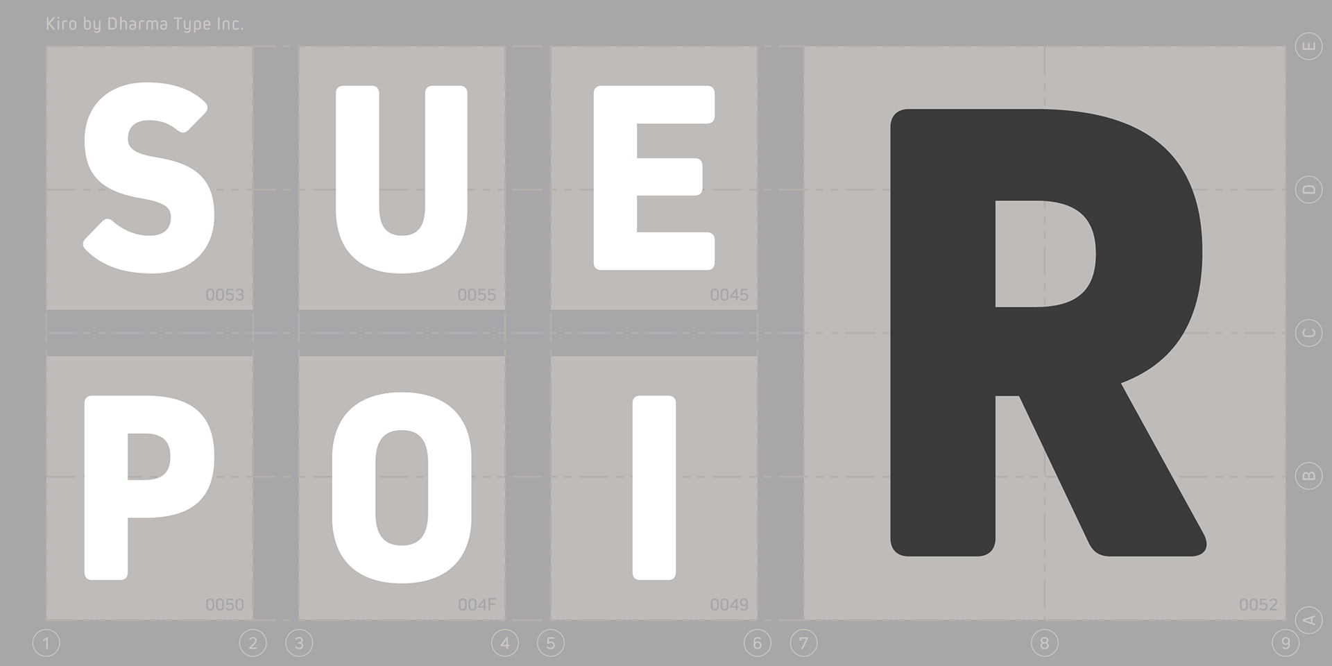
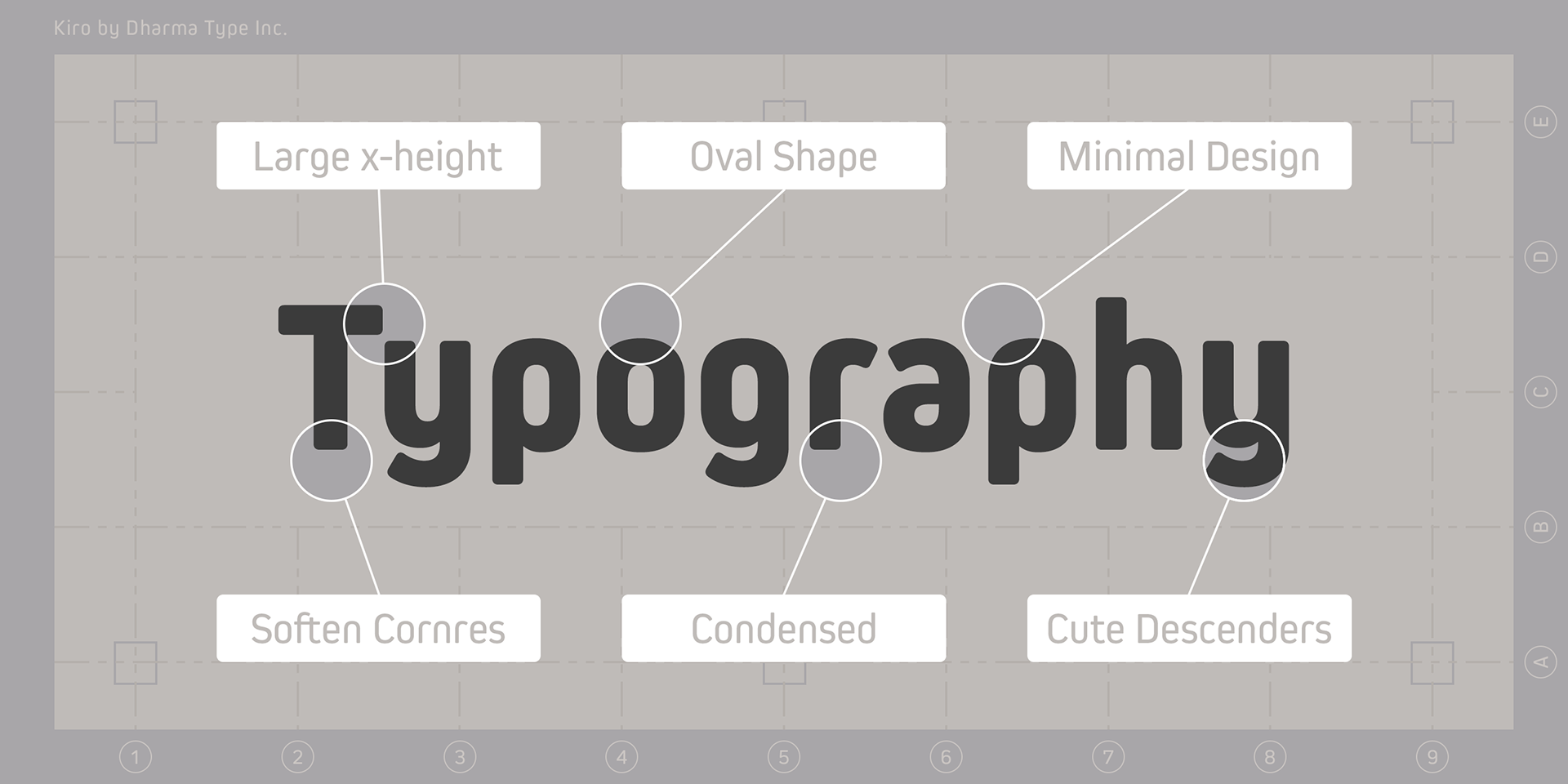
With its large x-height, Kiro ensures strong legibility and readability, even at smaller sizes.
The design features a semi-modular structure, with minimal letterforms achieved by removing unnecessary stems, and subtly rounded corners that add a warm, approachable feel.
The design features a semi-modular structure, with minimal letterforms achieved by removing unnecessary stems, and subtly rounded corners that add a warm, approachable feel.
Kiro strikes a balance between contemporary, urbane precision and friendly character, making it ideal for a wide range of editorial and branding applications.
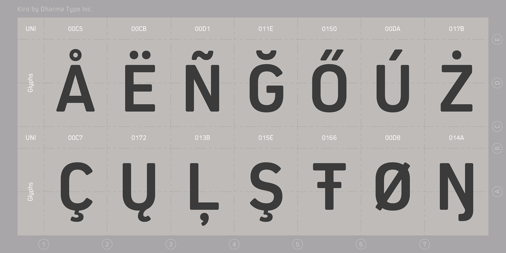
The typeface supports Western, Central, and South Eastern European languages, as well as Afrikaans.
It also includes superior/inferior figures, denominators, numerators, and fractions, all accessible through OpenType features.
It also includes superior/inferior figures, denominators, numerators, and fractions, all accessible through OpenType features.