
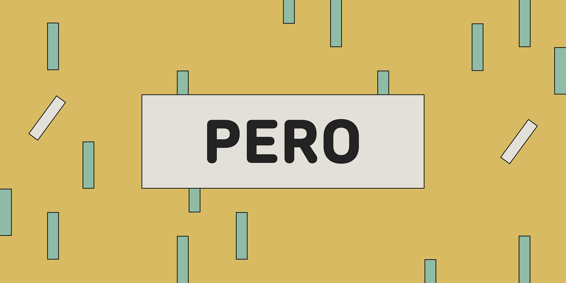


Pero
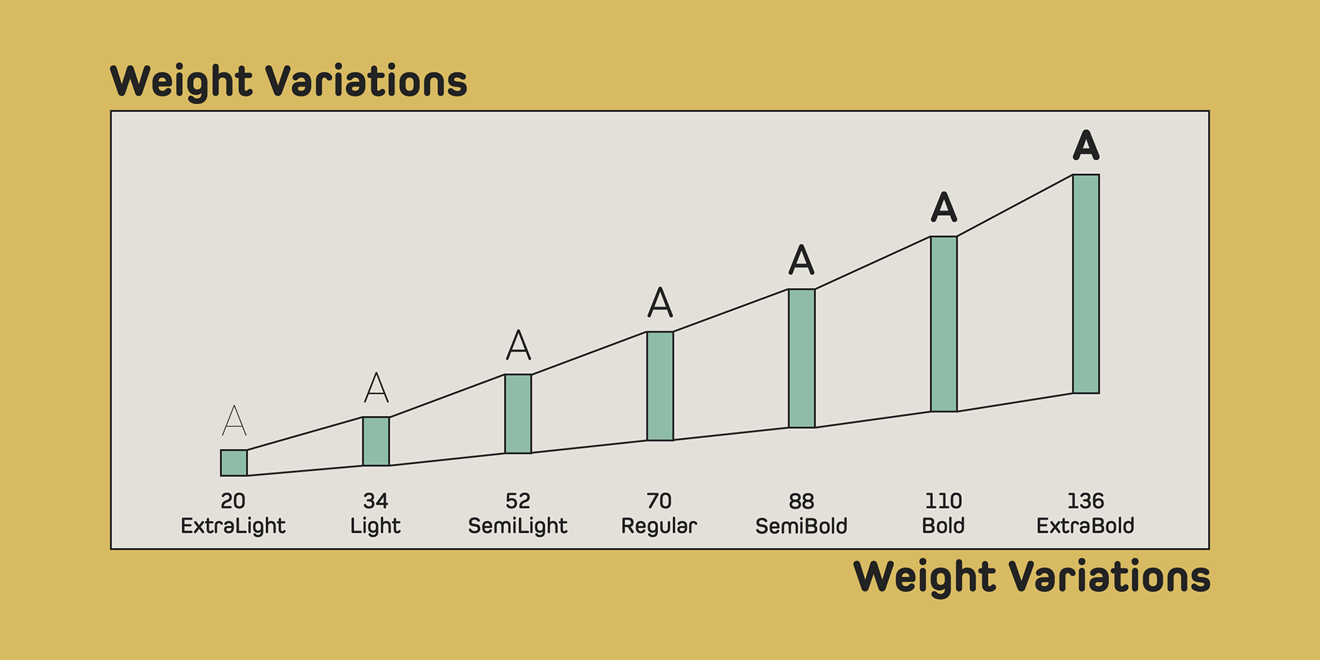
Pero is a condensed rounded sans-serif type family designed by Ryoichi Tsunekawa, featuring 7 weights from ExtraLight to ExtraBold.
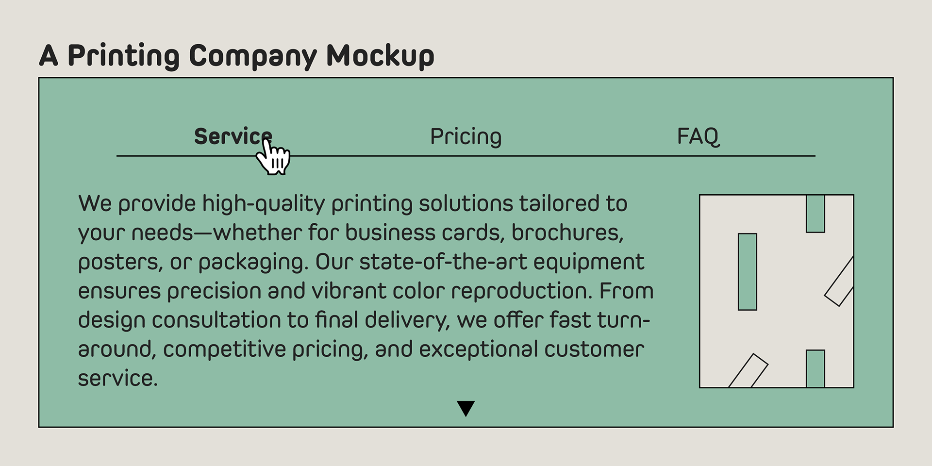
The broad range of styles offers versatility for titles, headlines, and body text, while the large x-height enhances legibility across all sizes.
The broad range of styles offers versatility for titles, headlines, and body text, while the large x-height enhances legibility across all sizes.
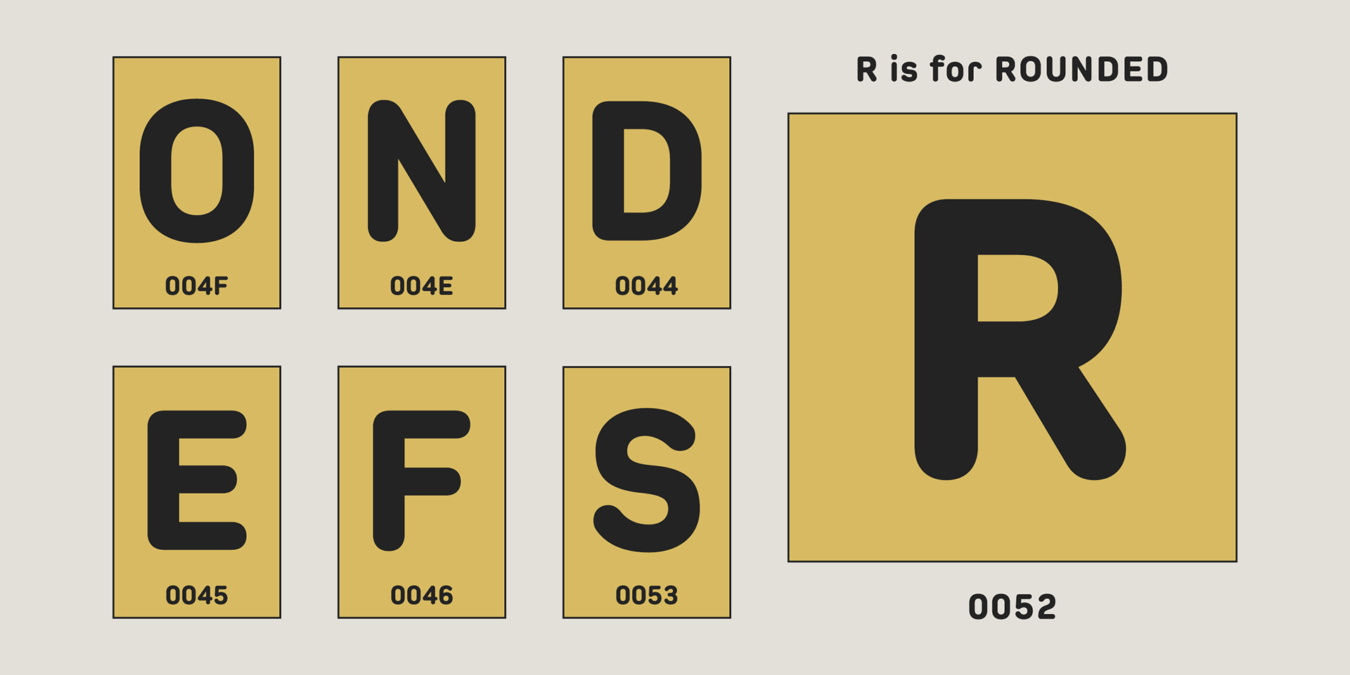
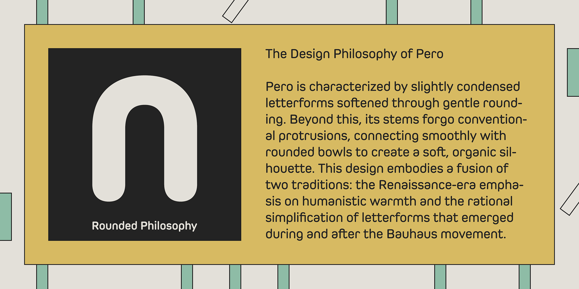
The letterforms are built on a modular skeleton, then minimalized by removing unnecessary stems, and finished with rounded terminals.
This combination of minimal modularity and soft curves gives Pero a distinctly contemporary, urban feel, while maintaining a warm and approachable tone. The subtle rounded styling also adds a moderate visual accent, making it perfect for modern branding and editorial use.
This combination of minimal modularity and soft curves gives Pero a distinctly contemporary, urban feel, while maintaining a warm and approachable tone. The subtle rounded styling also adds a moderate visual accent, making it perfect for modern branding and editorial use.
Pero supports a wide range of languages including Western, Central, and South Eastern European languages, as well as Afrikaans.
It also features superior and inferior figures, denominators, numerators, and fractions, accessible via OpenType features.
It also features superior and inferior figures, denominators, numerators, and fractions, accessible via OpenType features.