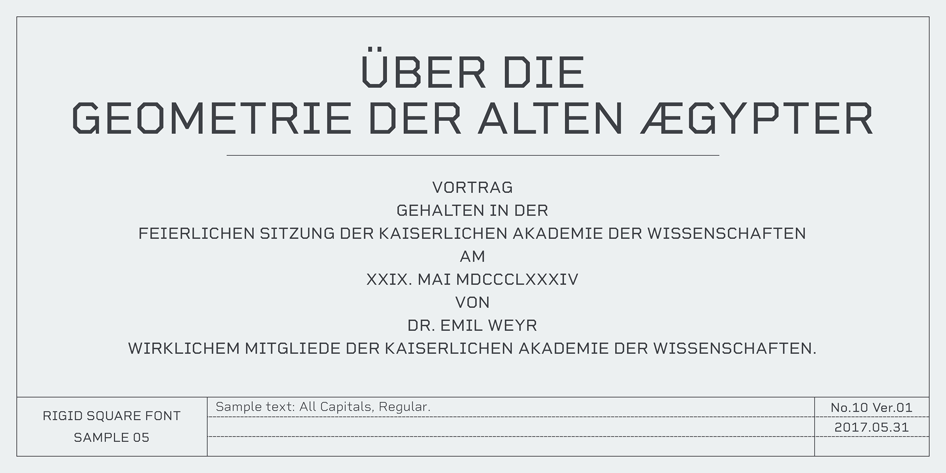
Rigid Square
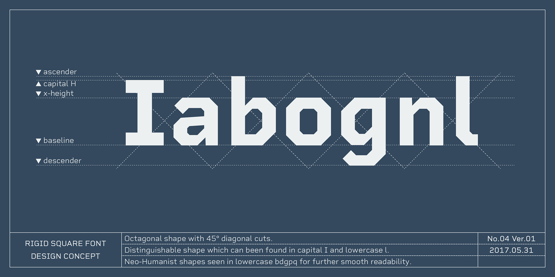
There’s a rule behind this typeface: octagonal shapes and precise 45-degree cuts.
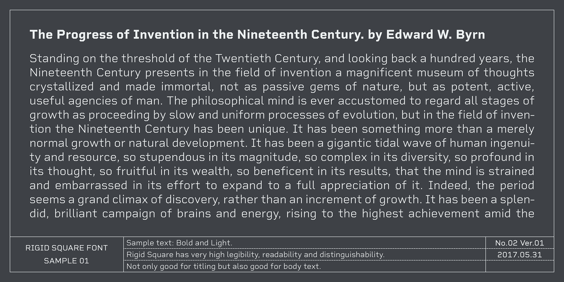
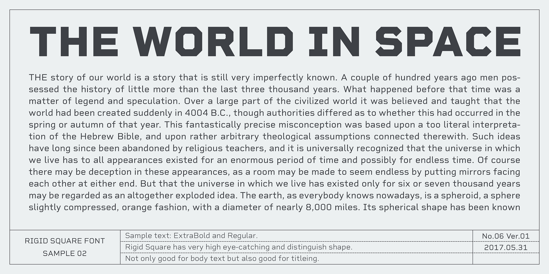
While highly geometric, it has been thoughtfully designed for body text and long-form content, such as mechanical instructions or technical documentation.
While highly geometric, it has been thoughtfully designed for body text and long-form content, such as mechanical instructions or technical documentation.
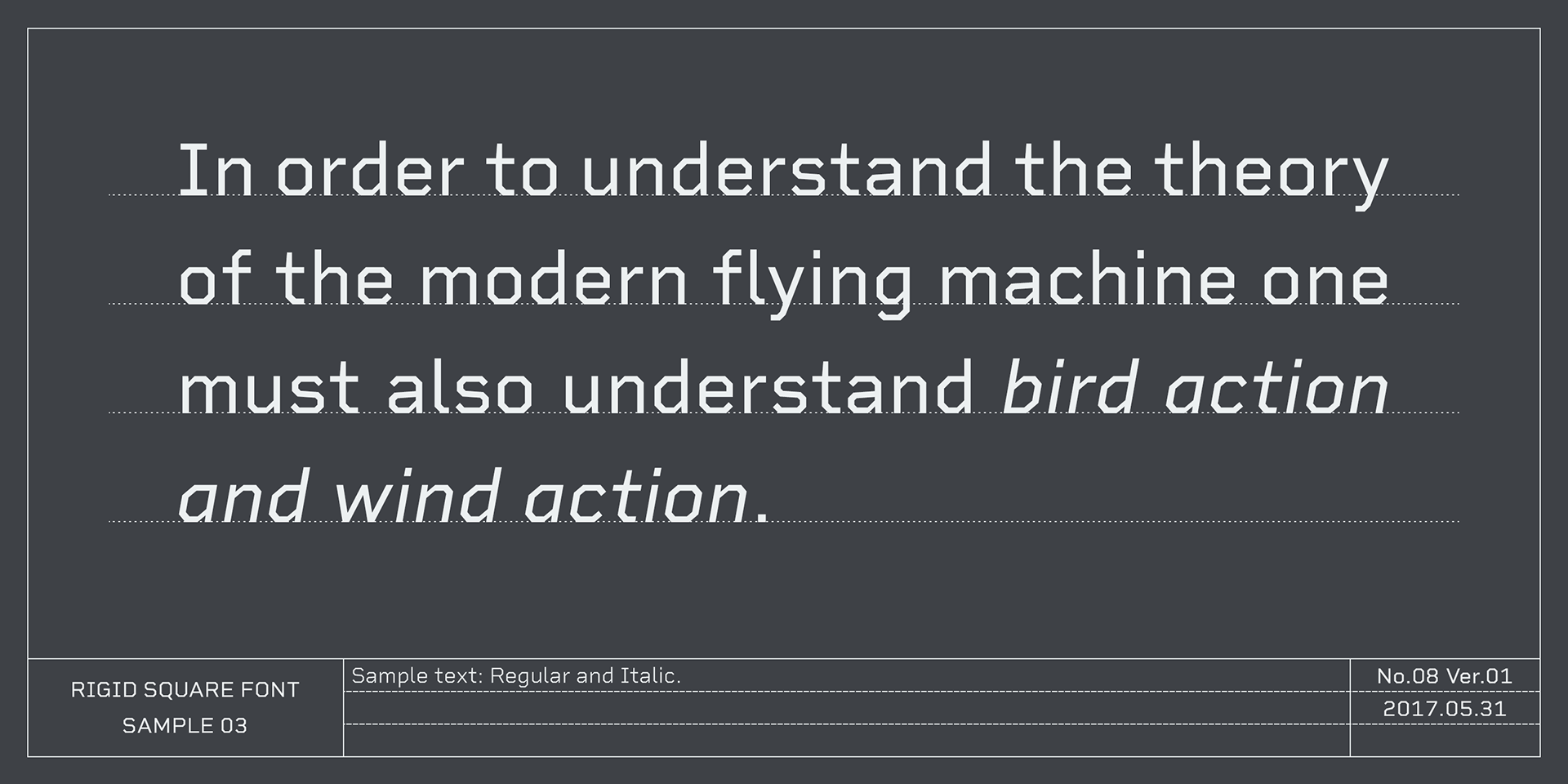
Special care has been taken to improve readability, with clearly distinguishable forms for capital “I” and lowercase “l”, and neo-humanist shapes for b, d, g, p, and q, enhancing smoothness and legibility in extended reading.
Despite its functional focus, the font’s sophisticated geometry also makes it ideal for display, titling, and captions, offering a striking and modern visual identity.
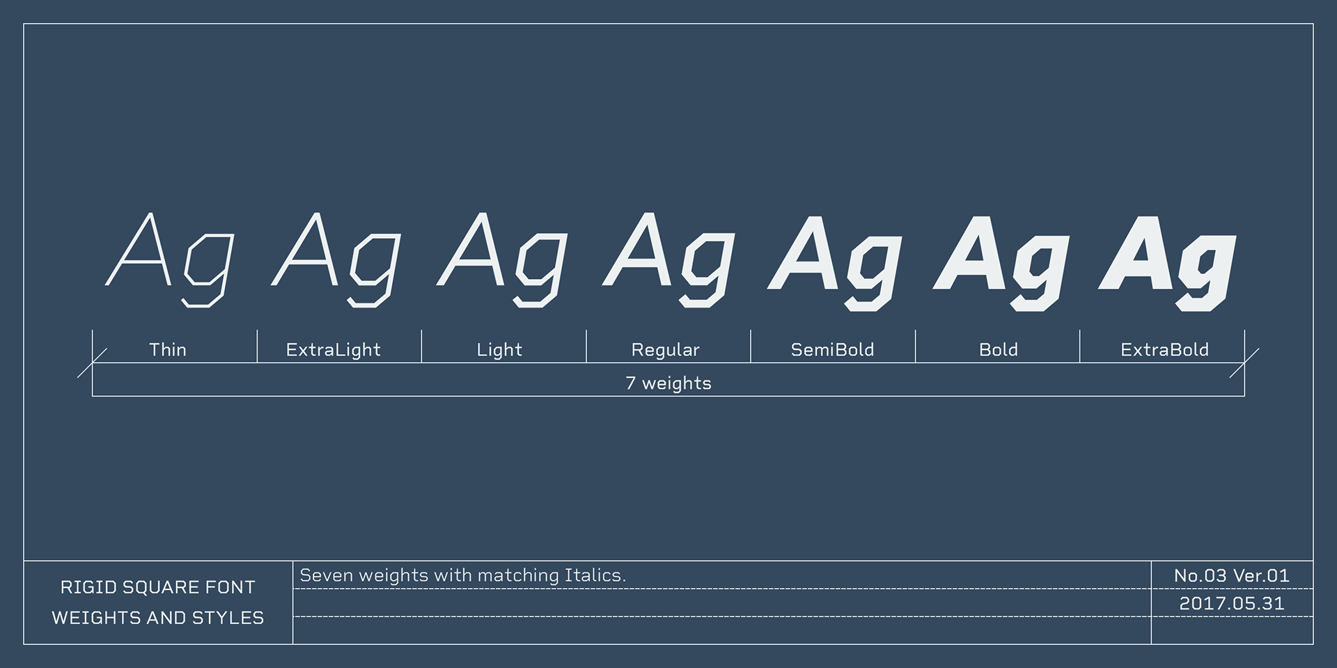
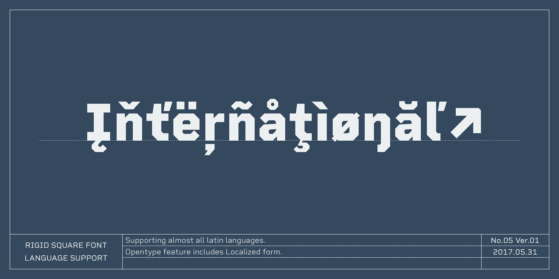
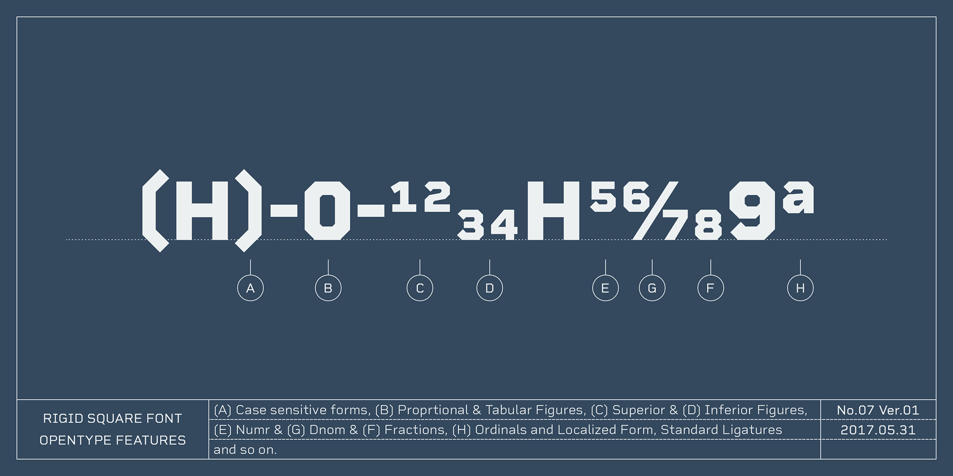
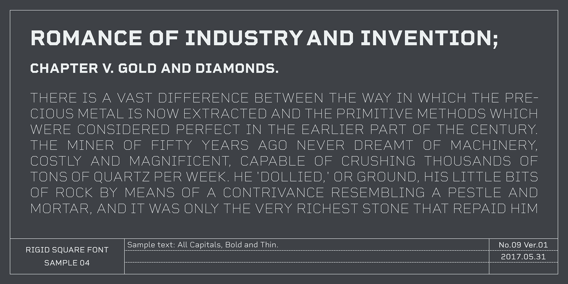
The family includes seven weights with matching italics, and supports almost all Latin-based languages—a versatile solution for both technical and creative use.
