

Tokyo Olive
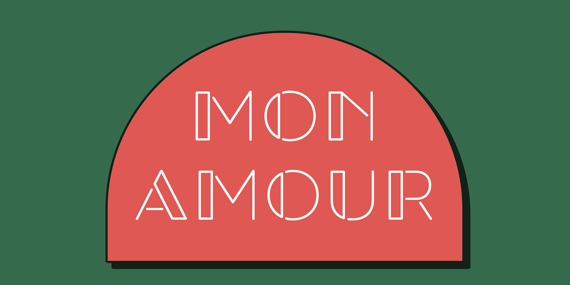
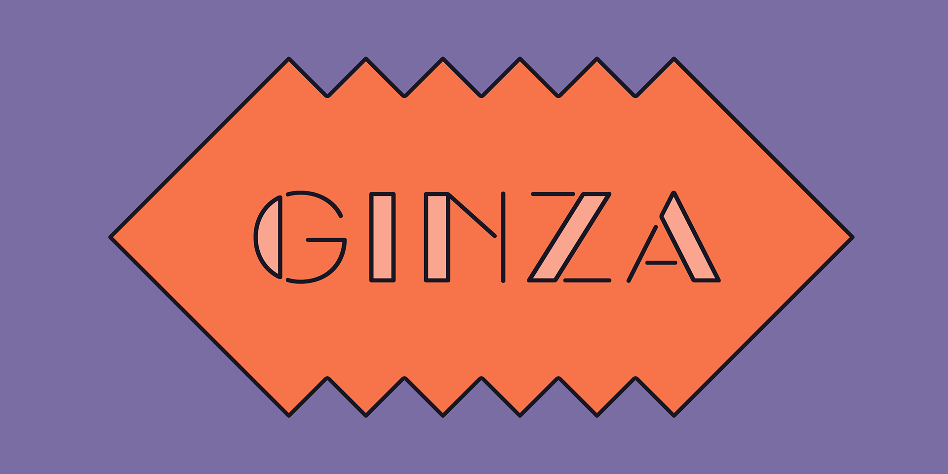
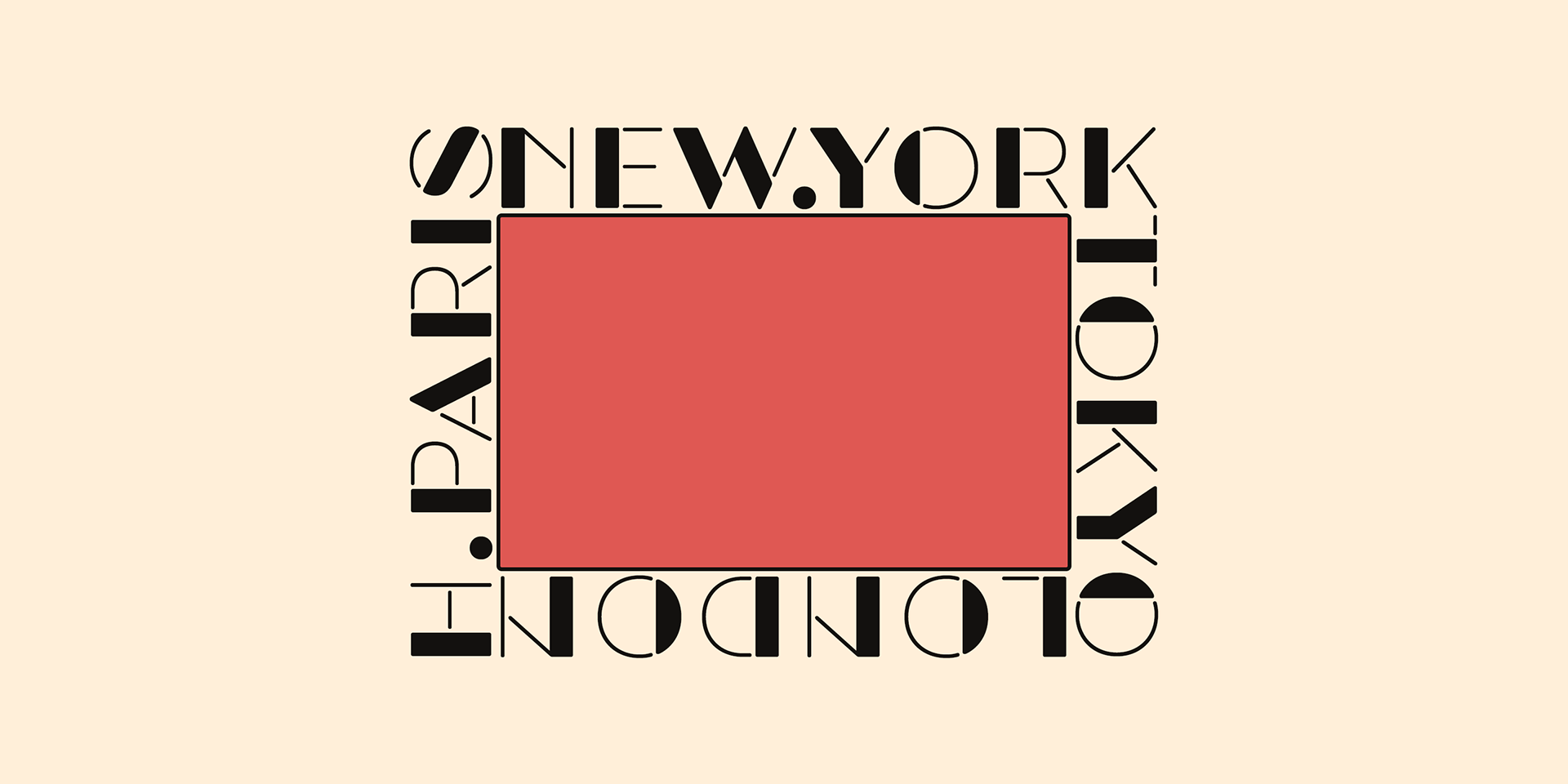
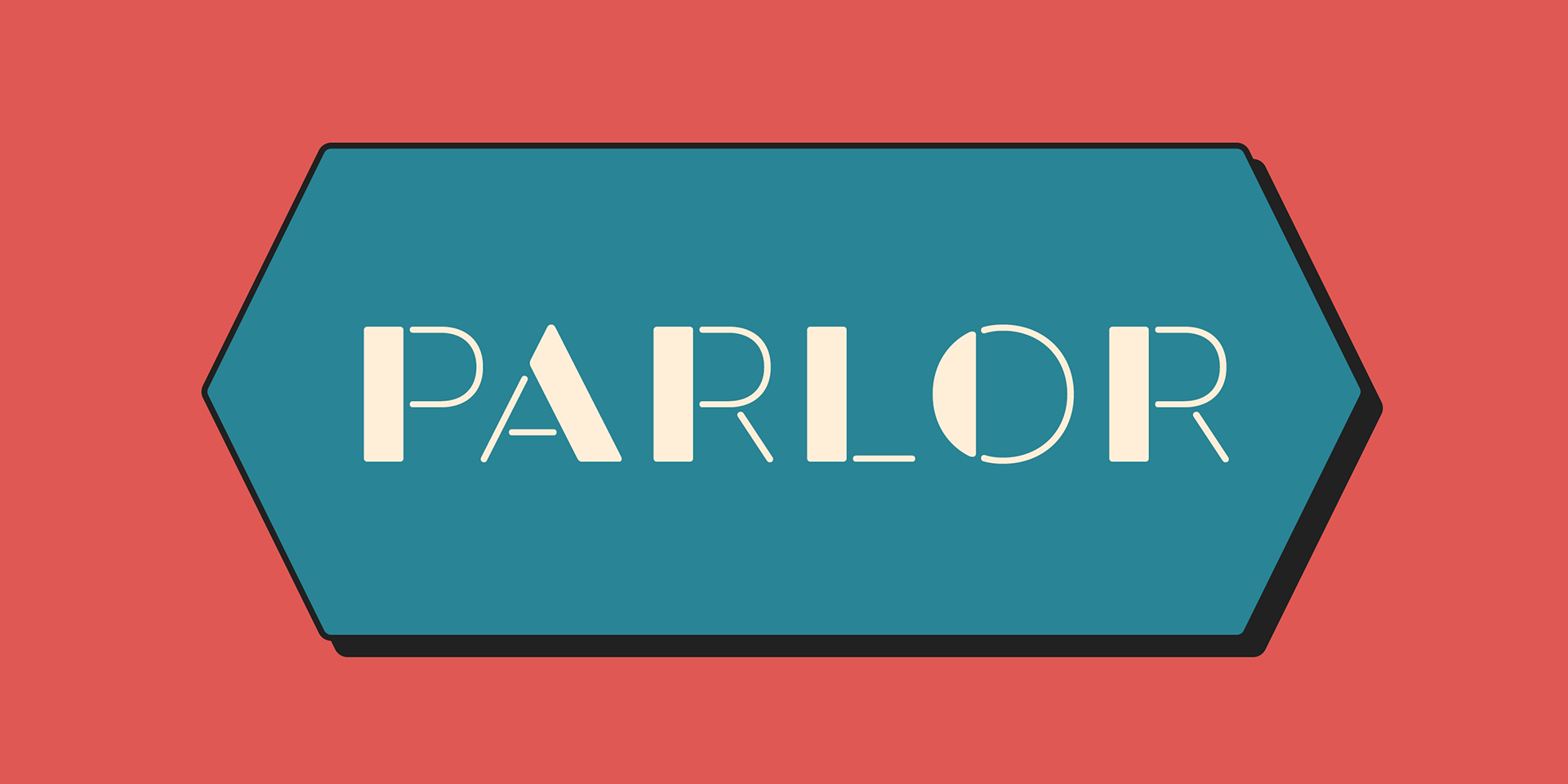
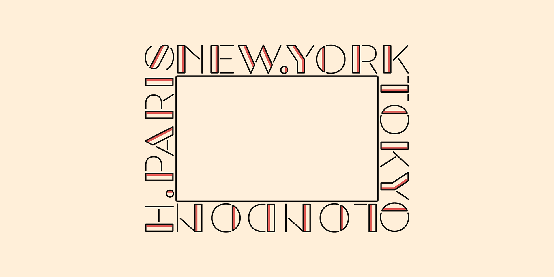
Tokyo Olive is a nostalgic display typeface designed as an homage to the decorative and playful typography found in mid-to-late 1980s Japanese advertisements.
This era in Japan was defined by a distinct wave of postmodernism, blending superficial form experimentation with girlish, fanciful aesthetics. Although this unique design movement faded in the 1990s, it left behind a brief but unforgettable legacy—and Tokyo Olive seeks to capture that spirit.
The typeface features a voluminous, geometric structure that reflects postmodern ideals, combined with rounded, craft-style stencil joints that echo the decorative flair of the time. A subtle classic open style adds a final layer of visual intrigue, resulting in a playful and unconventional blend that feels fresh and unexpected.
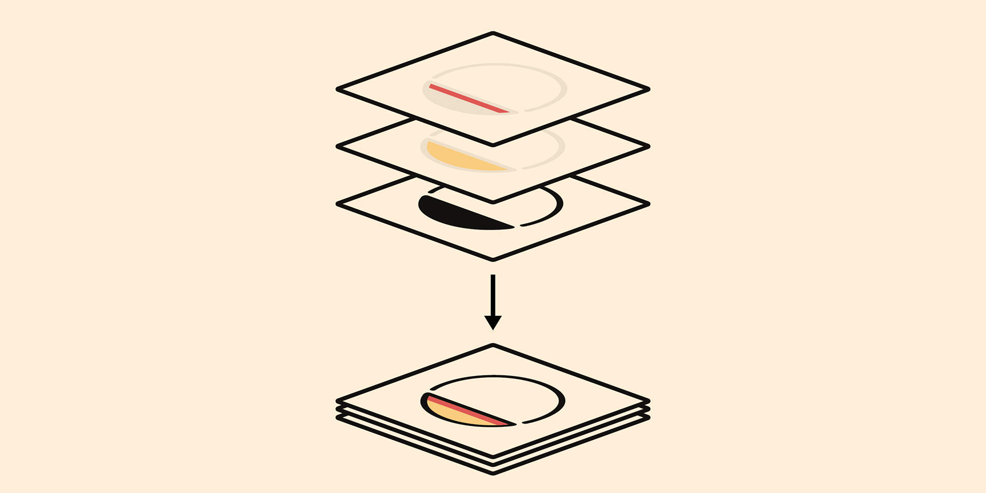
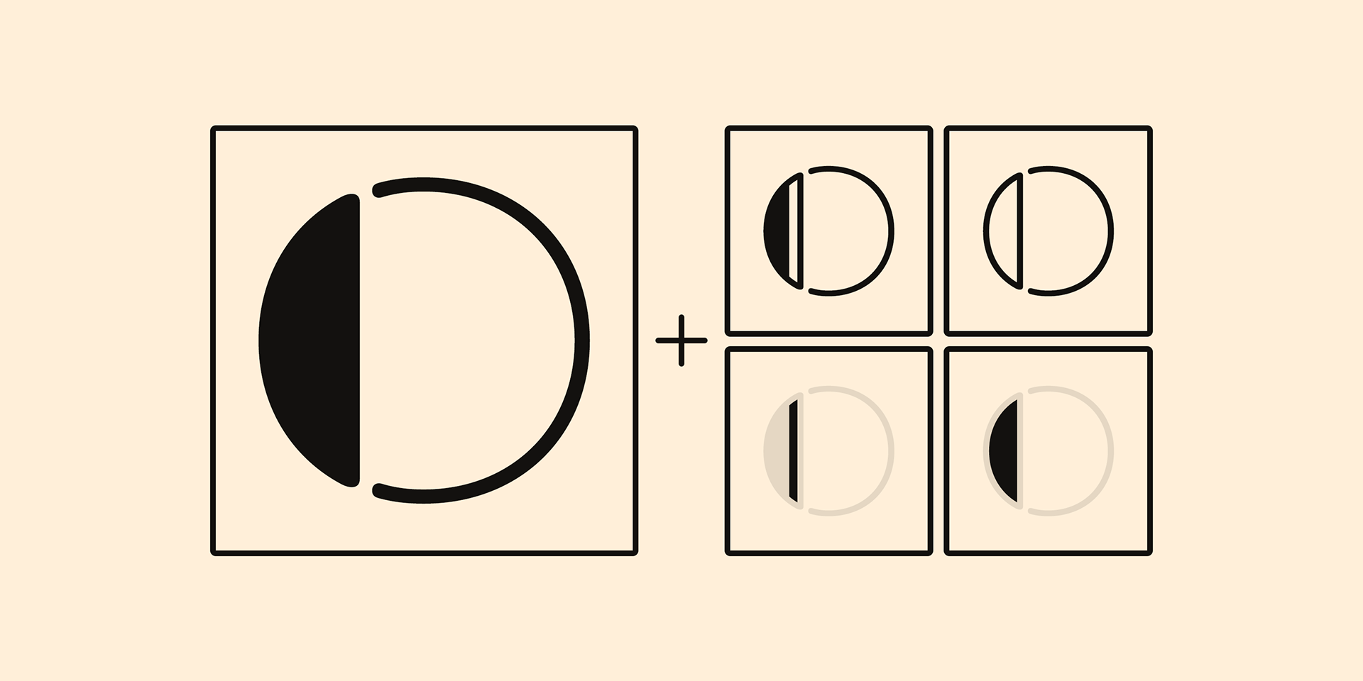
The Tokyo Olive family includes 5 styles, designed for layered color typography. Ideal for use in Photoshop, Illustrator, or any design software that supports layer-based workflows, each style acts like a woodtype printing plate, allowing you to freely assign different colors to each layer.
The “Standard” style serves as the foundation, while the additional “Fill” layers can be stacked to create open-style effects and vibrant multi-color compositions.
Instruction
1. Type your text as you like.
2. Set font-name "Tokyo Olive" and font-style "Standard".
3. Set color of "Standard" layer.
4. Duplicate the "Standard" layer to make "Fill" layer.
5. Set font-style "Half Fill" or "Full Fill" and new color of upper layer.
1. Type your text as you like.
2. Set font-name "Tokyo Olive" and font-style "Standard".
3. Set color of "Standard" layer.
4. Duplicate the "Standard" layer to make "Fill" layer.
5. Set font-style "Half Fill" or "Full Fill" and new color of upper layer.
Tokyo Olive Standard, Half Open, and Full Open style can be used solely.
