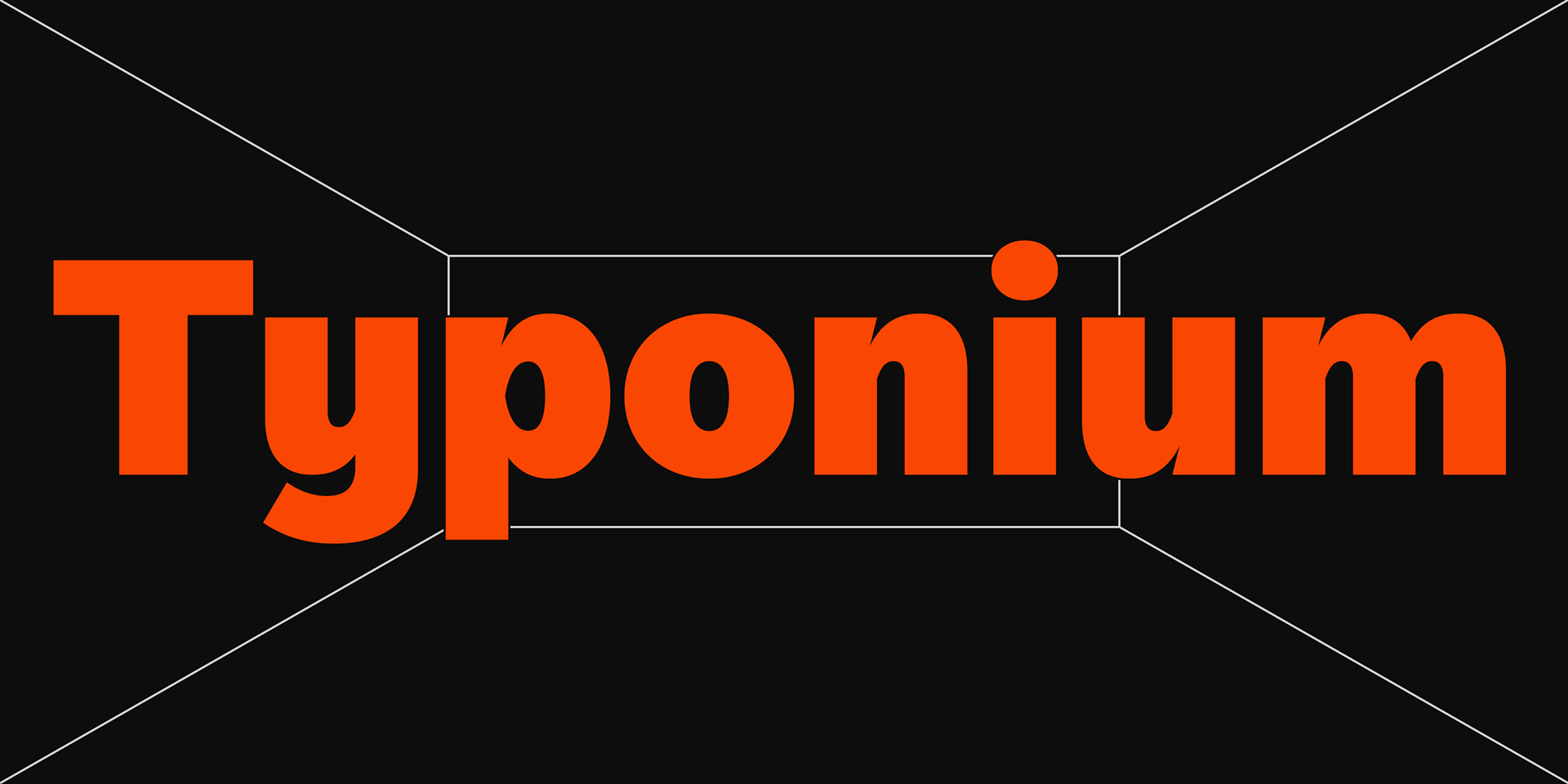


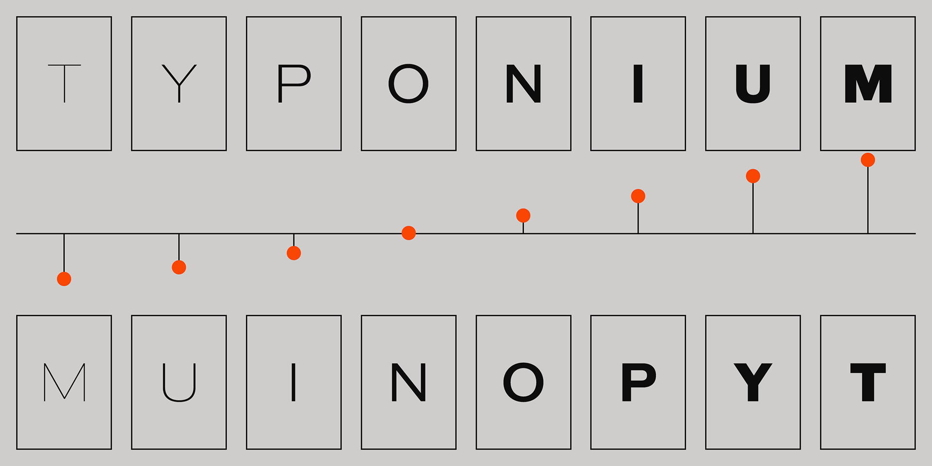

Typonium
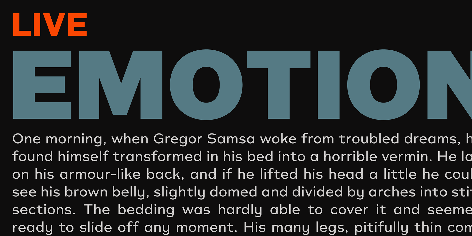
This typeface is fundamentally designed based on simple geometric forms.
Its foundation lies in the aesthetics of modernist movements such as Bauhaus and universal design—shapes that are minimalist, highly legible, and characterized by softly rounded bowls.
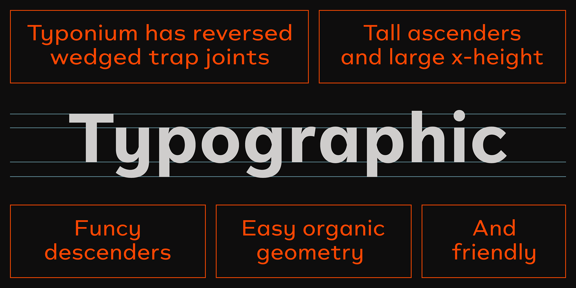
Ascenders, like those in f, and descenders, as seen in y and g, also carry a gentle roundness, creating an overall impression that feels warm and endearing.
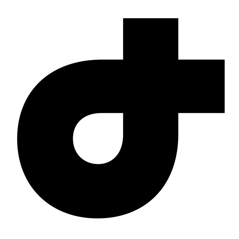
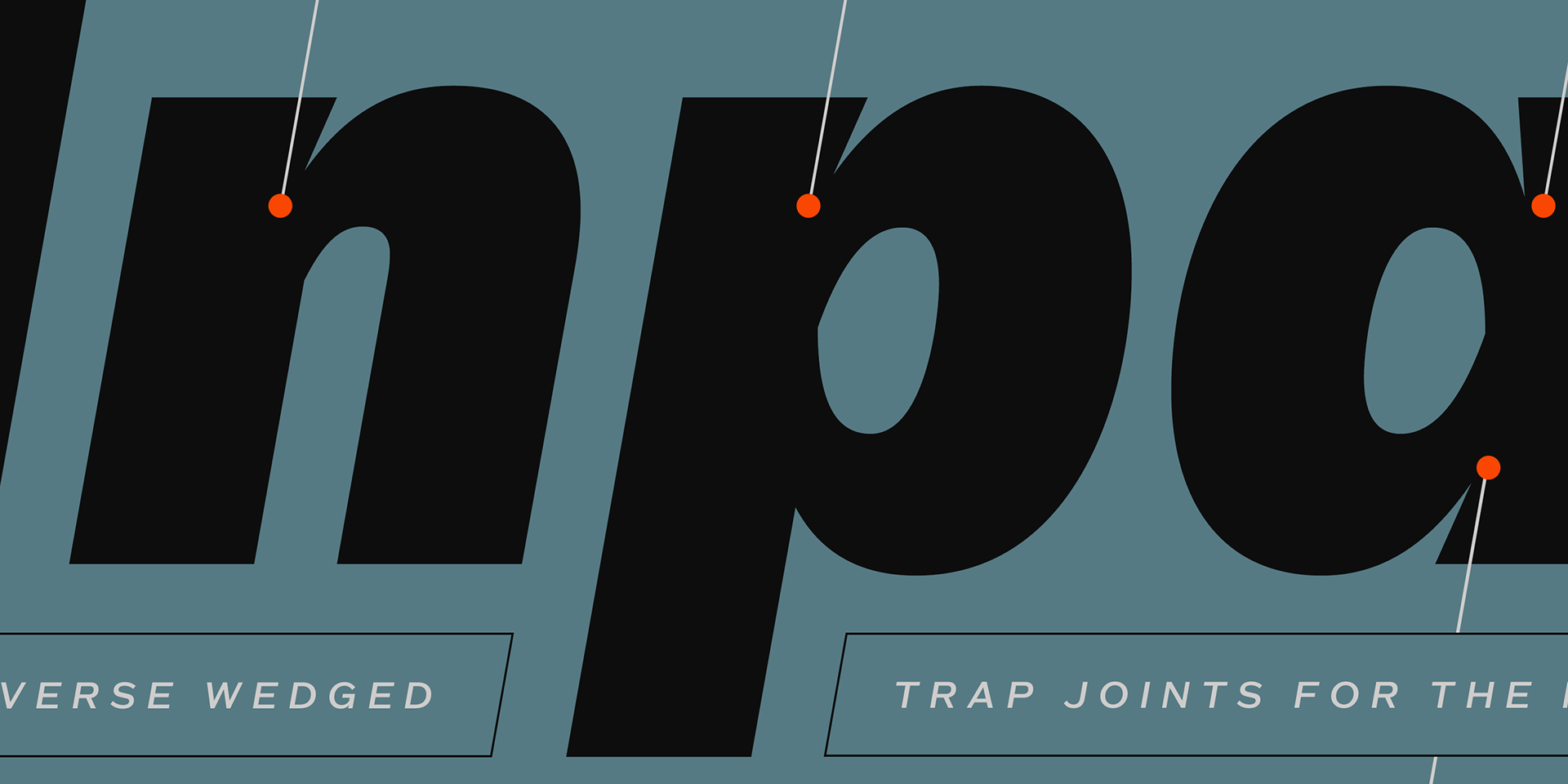
Yet, the most distinctive feature of this typeface lies at the junctions where stems and bowls meet. Unlike conventional typefaces, these points are treated with reverse ink-traps. This unique approach lends the entire typeface a sharp, defined presence, full of visual tension and clarity.
Soft and sweet, yet strong and striking—
This typeface exists in a curious balance between opposing impressions.
It’s almost as if, like in quantum mechanics, two different states overlap and exist simultaneously.
A quiet contradiction, held beautifully in tension.
This typeface exists in a curious balance between opposing impressions.
It’s almost as if, like in quantum mechanics, two different states overlap and exist simultaneously.
A quiet contradiction, held beautifully in tension.
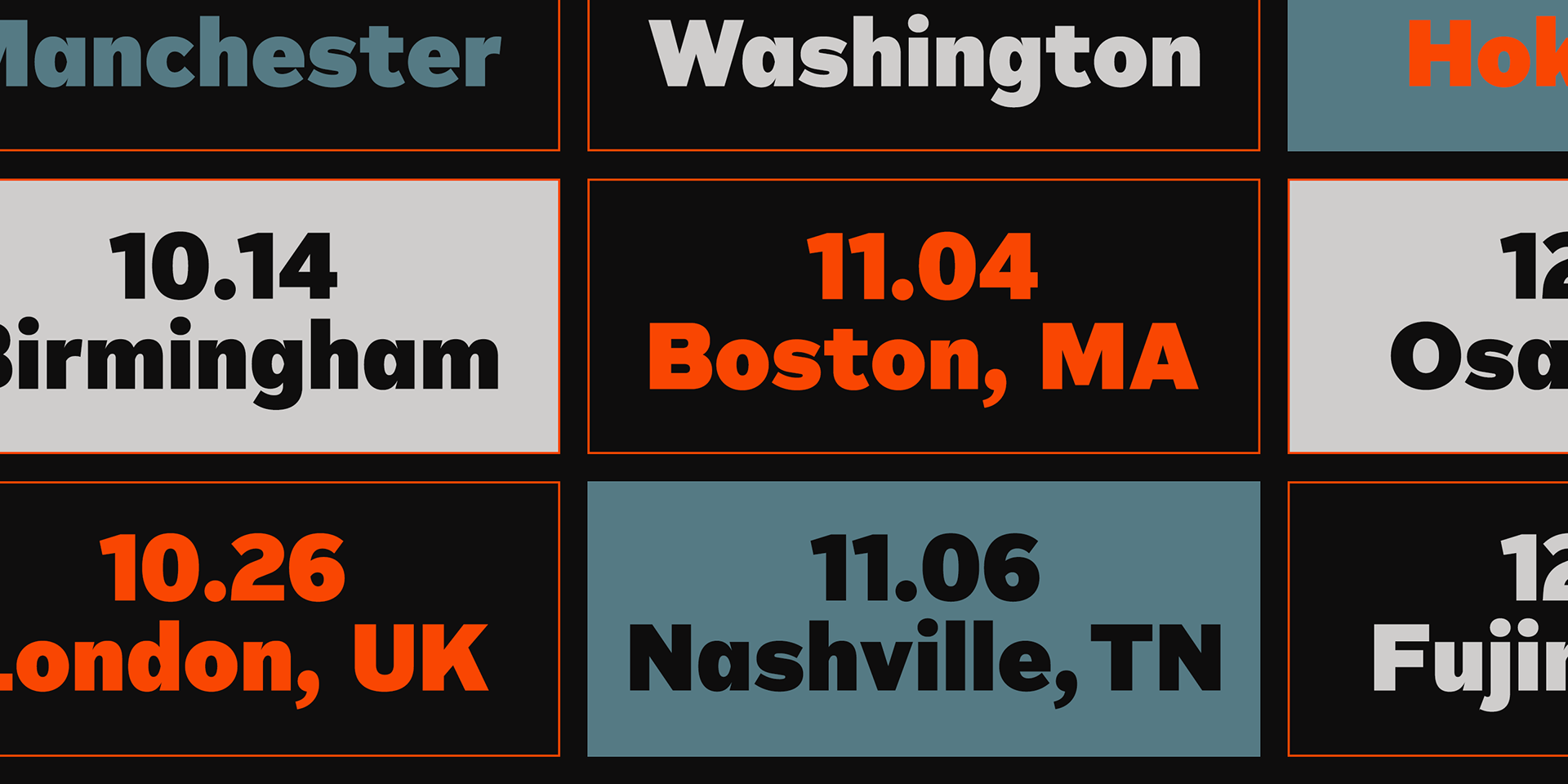
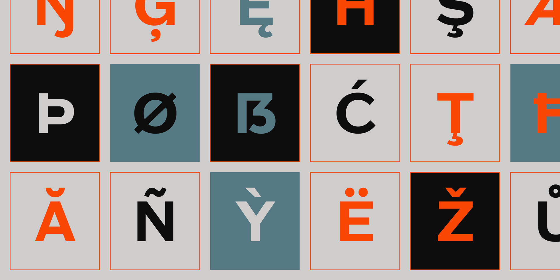
The type family consists of eight weights, each with a corresponding italic, and supports a wide range of Latin-based languages.