

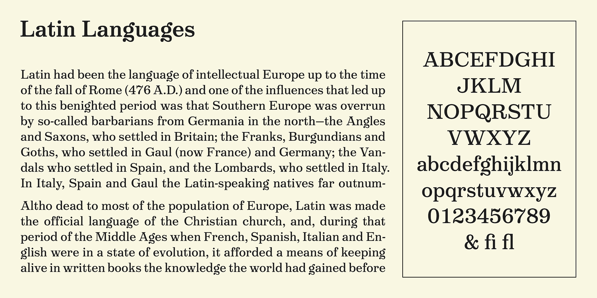
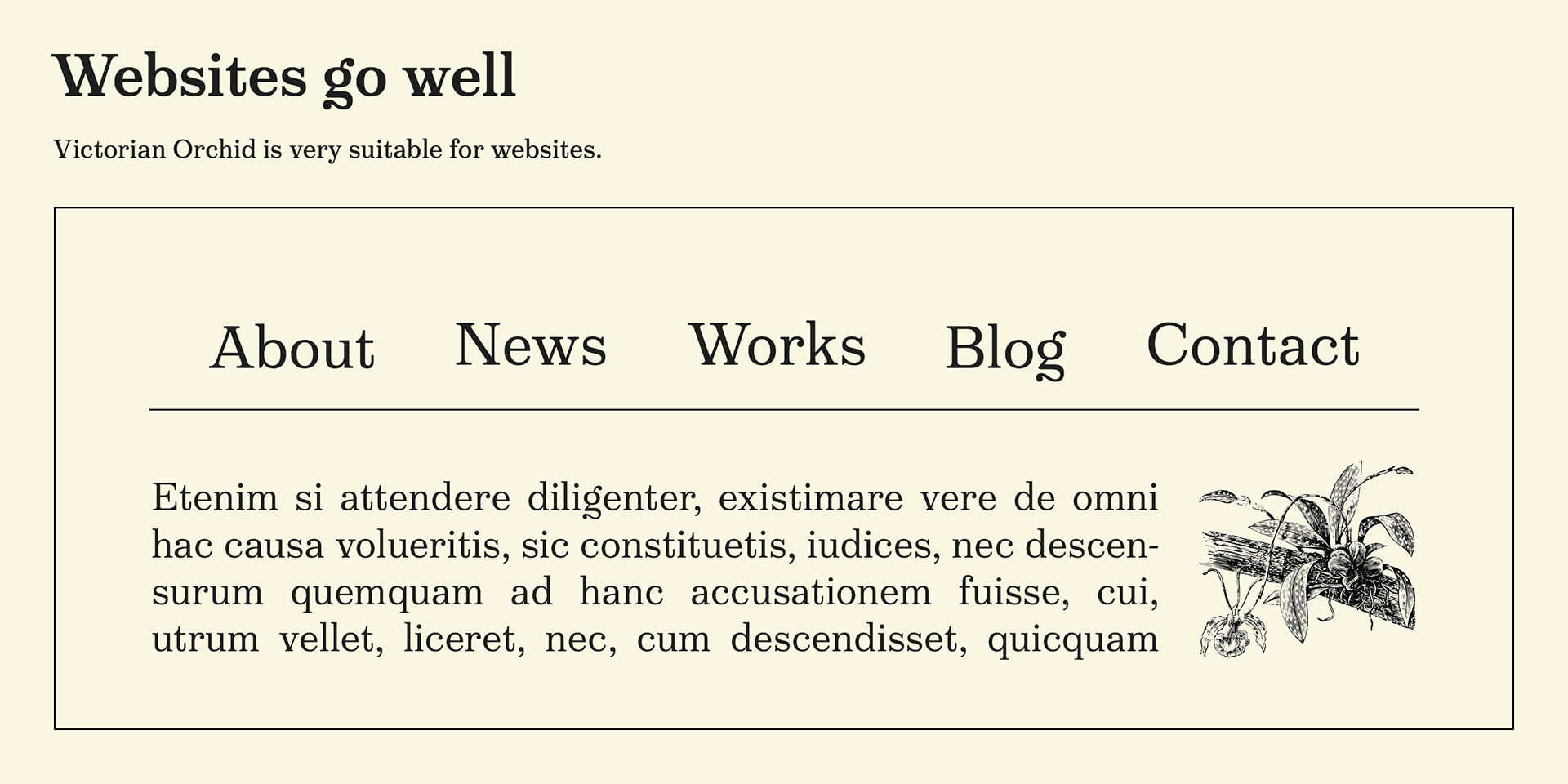
Victorian Orchid
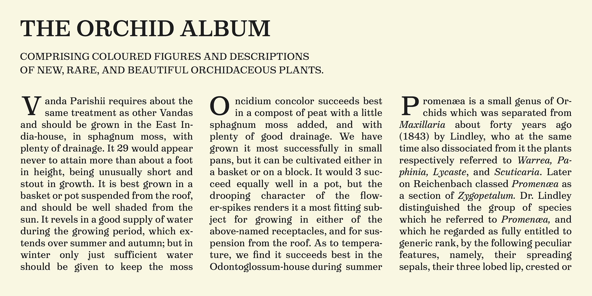
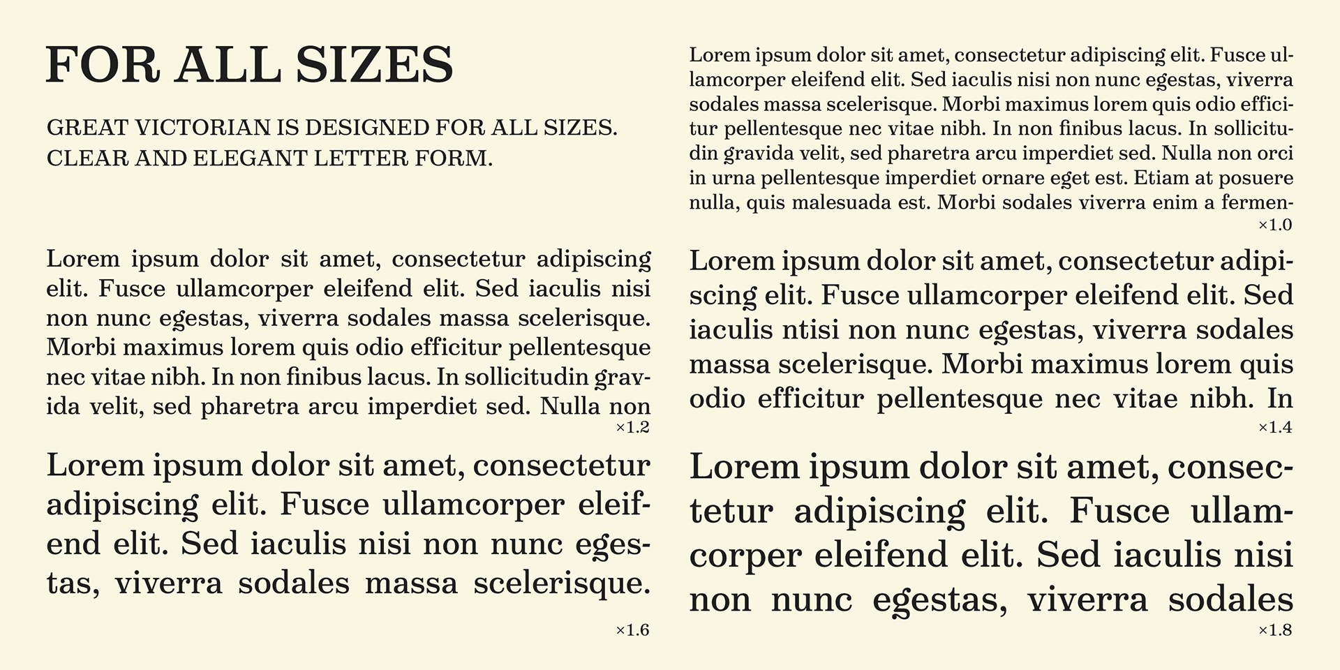
Victorian Orchid is a beautiful, organic serif font family designed for both text and display applications, blending the elegance of the Victorian era with contemporary typographic versatility.
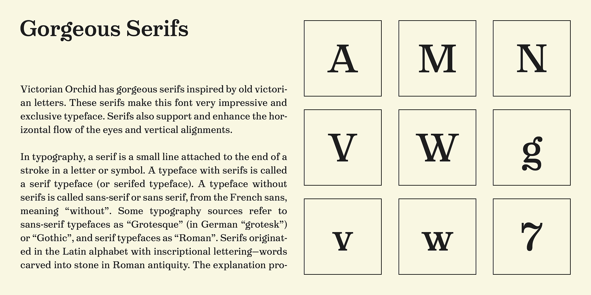
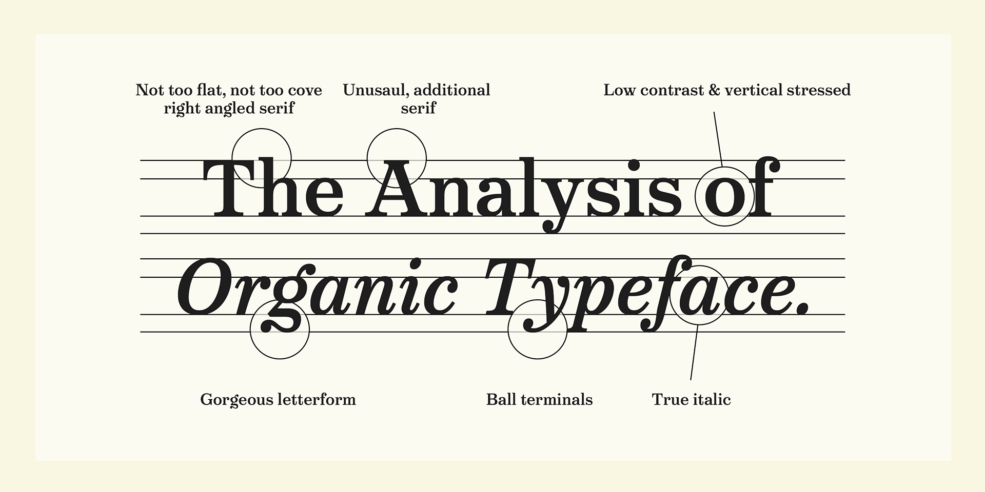
Its distinctive serifs, especially on characters like A and other diagonal forms, are inspired by decorative Victorian type and lettering. These unusual, expressive details enhance both horizontal readability and vertical alignment, creating a harmonious visual rhythm.
A highlight of the design is the striking lowercase “g”, one of the most dramatic letterforms in the set, rooted in historical influences.
Other lowercase letters—such as n and d—feature horizontal serifs crafted with the same thoughtful approach.
Other lowercase letters—such as n and d—feature horizontal serifs crafted with the same thoughtful approach.
Stylistically, Victorian Orchid sits at the intersection of several traditions:
- It has an organic, humanistic feel reminiscent of Transitional serifs like Times New Roman
- It embraces the strong vertical stress and refined serifs of Modern serifs
- Its low contrast and sturdy, moderately curved serifs lend it the casual strength of a Slab serif
The result is a typeface that is at once sharp, handsome, and readable, yet also soft, approachable, and rich in character.
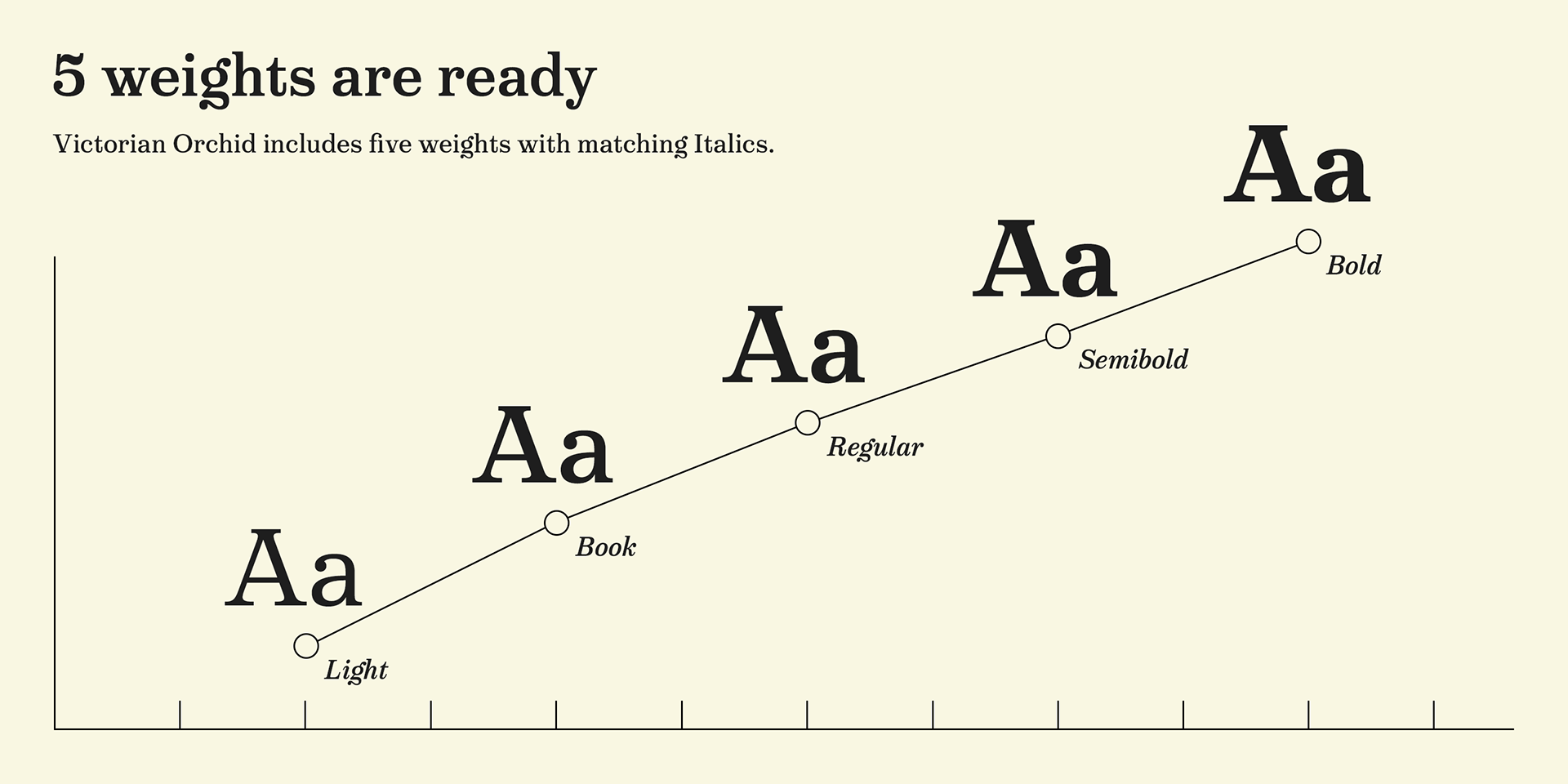
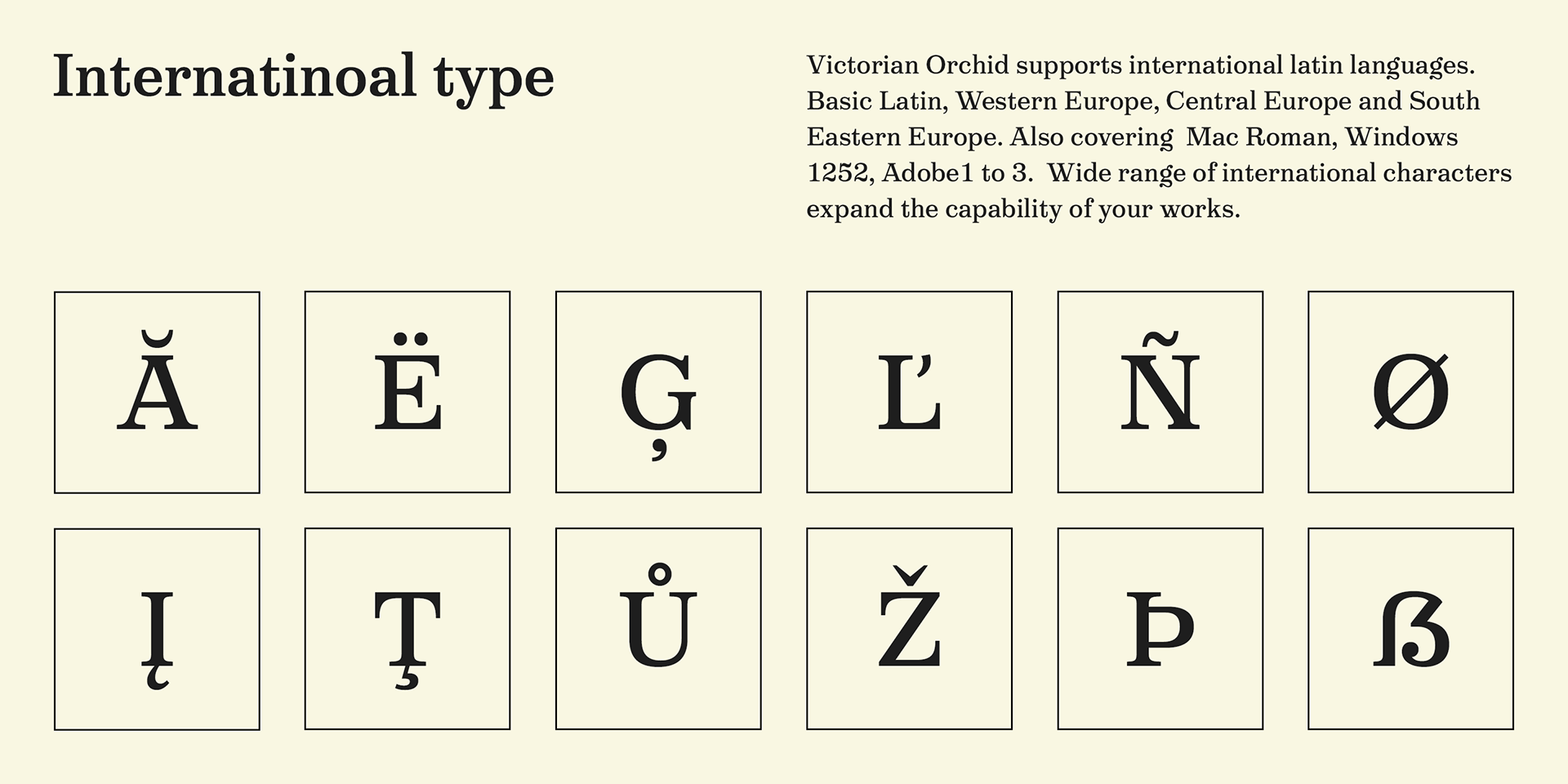
The Victorian Orchid family includes 5 weights from Light to Bold, with approximately 500 glyphs per style, international accented characters, and OpenType features.
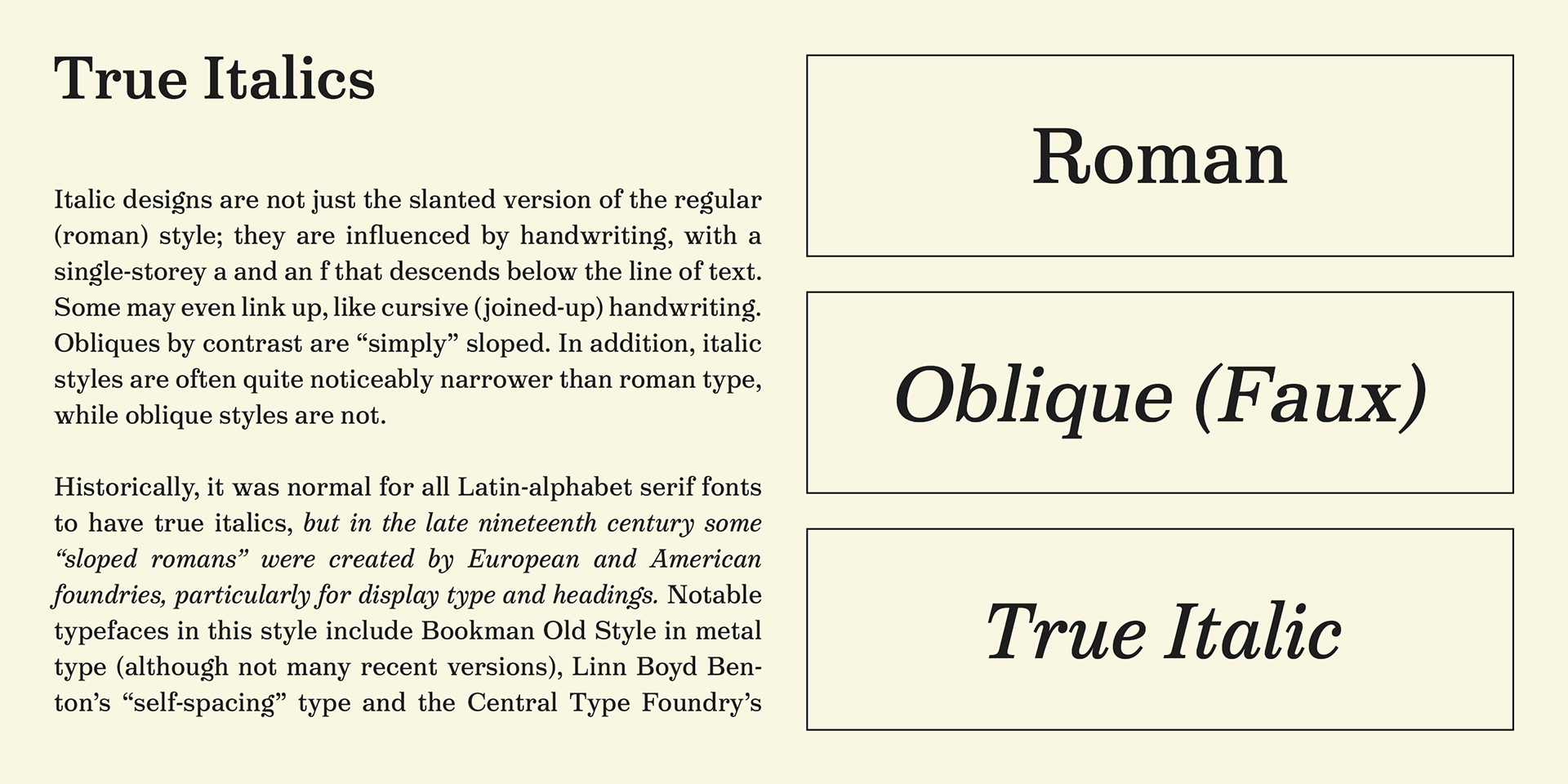
The italics are true italics, carefully designed to harmonize with the Roman styles, offering a refined, cohesive typographic experience.
The italics are true italics, carefully designed to harmonize with the Roman styles, offering a refined, cohesive typographic experience.